WORTH
WORTH (Women's Organization on Rights to Health) is a student org at the University of Michigan. WORTH members complete year-long projects in focus groups dedicated to sub-topics within reproductive health and advocacy.
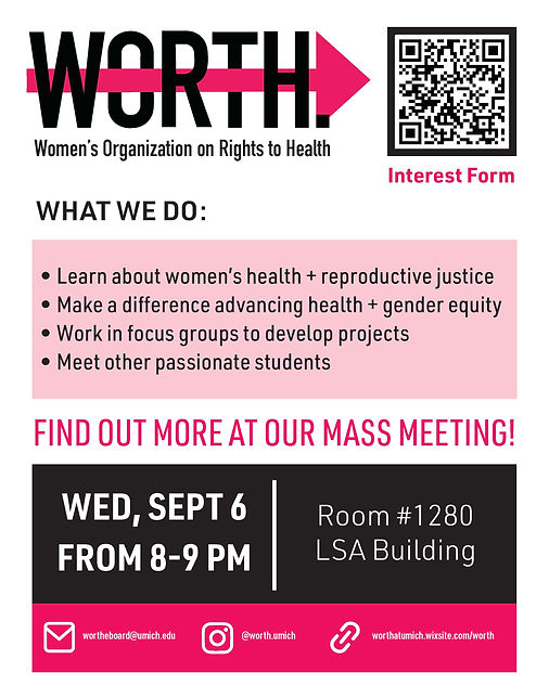
As the design and communications lead for WORTH, I created event flyers and apparel designs. These assets helped raise the group's visibility and build membership.
WORTH Logo Variations
Colors

various pinks were used. I chose 2.
Pre-Existing Elements
Printed Design
Festifall Flyer
For our Spring 2024 volume, our team landed on the theme of growing up. As many in our club are now graduating seniors, the topic resonated with us, and we leaned into the ambivalence and thrill of impending departure from our undergrad years.
To visualize this theme, I illustrated the growth of a seedling which eventually blooms into a radiant orange flower whose petals stretch across the sky. The theme's title became a graphic element, the text tapered along the growth path. The word "UP" is in the flower's center as the focal point of the page, a sort of symbolic and visual destination at the end of the word "GROWING."
Social Media


Eboard Intro Posts
I created a template to introduce my fellow executive board members on WORTH's Instagram. To the left is the version we used, and below are 2 alternative versions I drafted. All versions are shown using my face and name as an example, and placeholder text for the body text in all sections.
Color Pallete
I designed these posts before narrowing the color palette and so I used 3 pinks for the non-photo elements.


Apparel

I created this design for our spring merch (black hoodies). Visual exploration led me to this graphic featuring concentric wavy colorful lines around the WORTH logo.
Color Pallete
I used the main pink color already associated with WORTH and added 4 others to try and create a bright, happy feel.
